Back to work

Case Study

EZ Cash: Reinventing
How a Bank Lends

Turning a two-week, branch-bound loan process into a self-service product that disbursed ₦12.8 billion in its first year.

Product Designer, UX & UI Stanbic IBTC Launched Nov 2019 Web · Mobile · USSD · Internet Banking
EZ Cash Plus dashboard on a laptop — showing loan balance, repayment schedule and loan history for Adewale Alogbo

At a glance

Role Product Designer: UX research, UI design, prototyping
Tools Figma · Proto.io · OmniGraffle · pen & paper
Method Design Thinking: Empathise, Define, Ideate, Prototype, Test
Headline result ₦12.8 billion disbursed in year one

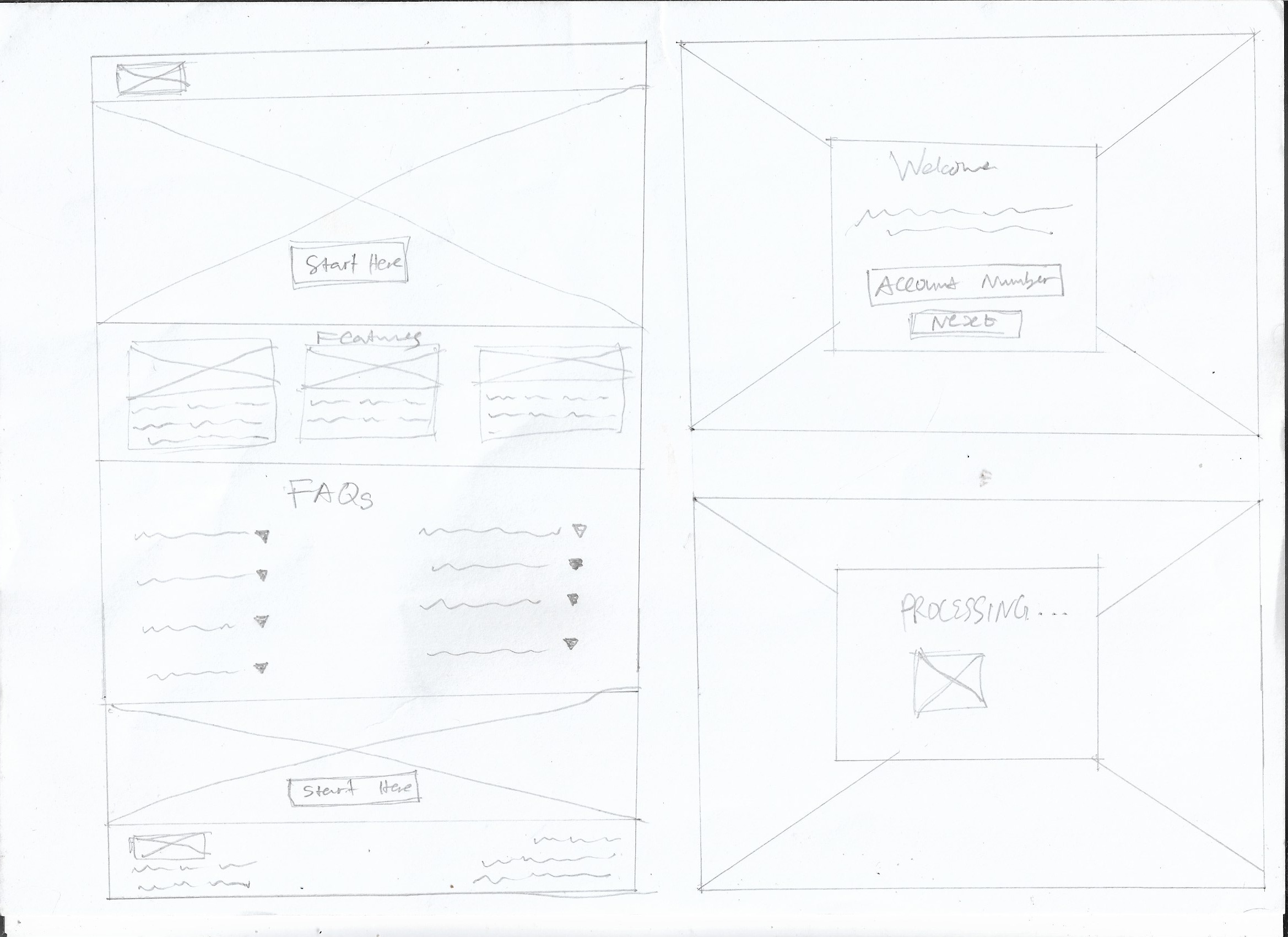
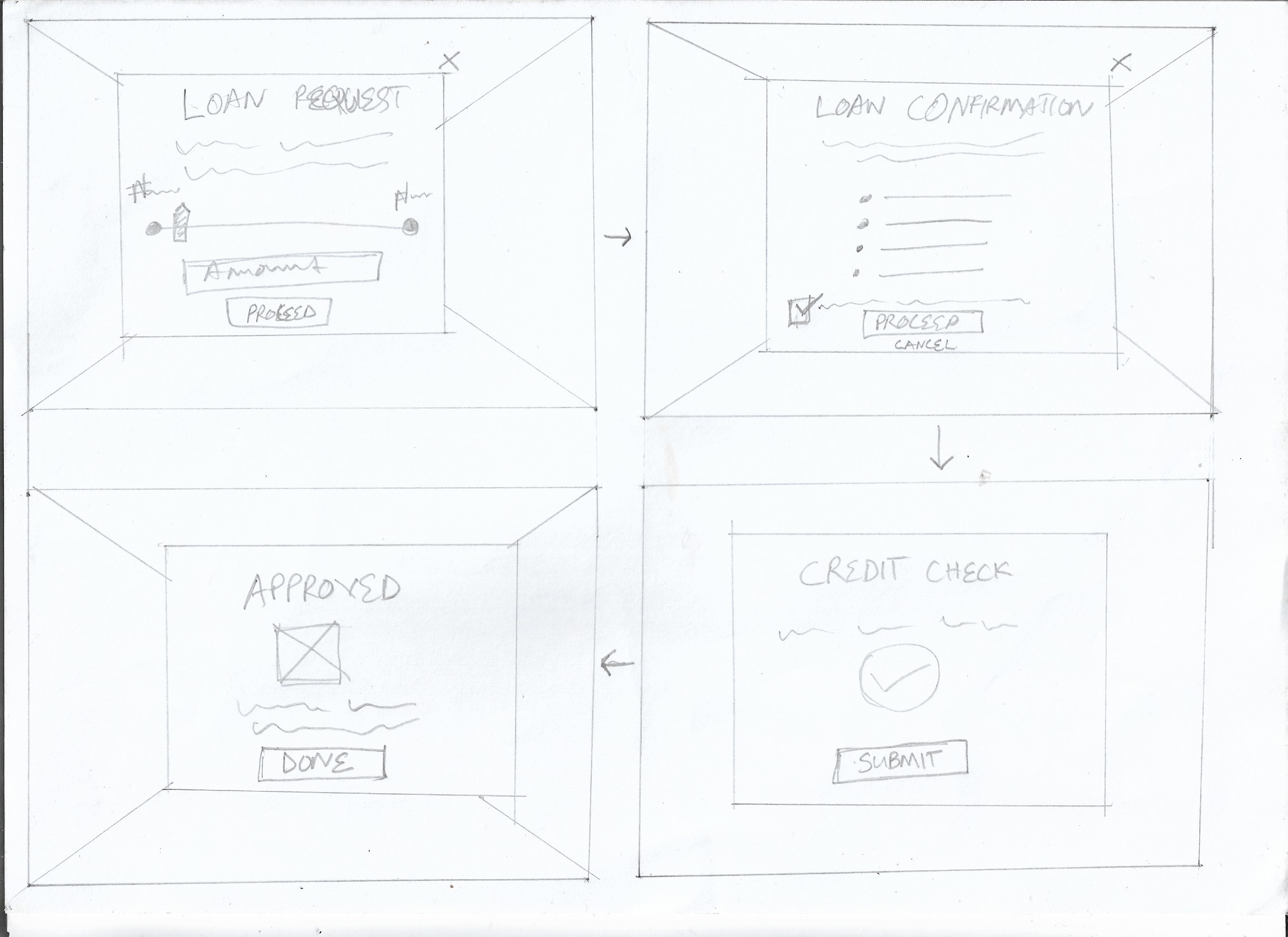
One loan. Zero paperwork. Under six minutes.

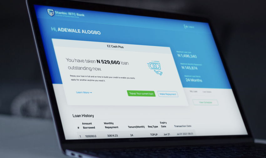
EZ Cash is Stanbic IBTC's flagship unsecured-loan product, giving eligible customers instant access to short-term financing for personal, education, or business needs, entirely without branch visits or documentation.

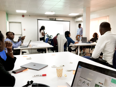
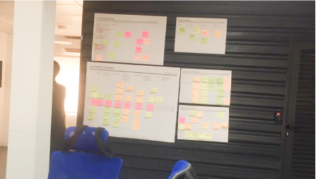
I led UX from customer research through to a launched, multi-channel product, with particular focus on the web experience.


Borrowing meant queues, paperwork, and a two-week wait

Getting a loan meant a branch visit, lengthy paper forms, and waiting up to two weeks for a decision. I ran stakeholder engagements and brainstorming sessions with the product and lending teams. The same frustrations surfaced every time.

Lengthy form filling Long processing delays Mandatory branch visits Queuing just to start No digital channel
Empathy map built from customer interview insights — shows what customers say, think, do and feel about the loan process
Empathy map, customer interview synthesis
Brainstorming session with product stakeholders — team working around tables with laptops and materials
Stakeholder brainstorm session
Post-it note affinity boards on the wall from the brainstorming session, organising insights by theme
Affinity mapping, insights by theme

Who I designed for

I distilled research into two personas: Sarah, a marketing executive who valued fast, simple access to credit, and Ibrahim, a mobile-first engineer who wanted a straightforward, trustworthy digital experience. Journey mapping made the friction impossible to ignore.

"Enable existing bank customers to access loans in a convenient, secure, and user-friendly way, overcoming the limitations of traditional branch-based banking."

Problem statement
Persona: Sarah — salaried marketing executive who values fast, simple access to credit
Sarah · Marketing Executive
Persona: Ibrahim — mobile-first engineer who wants a trustworthy digital experience
Ibrahim · Software Engineer
User journey map — end-to-end loan application flow from discovery through eligibility check to disbursement
User journey map: discovery, eligibility, disbursement

Turning insights into features

Working with the bank units involved in lending, I ran brainstorming sessions to pressure-test ideas against the problem statement. Four core features emerged.

Instant eligibility

Real-time status check against credit-bureau data via account and phone number only.

Personalised loan limits

Derived from existing bank records, transaction history, and spend behaviour.

Loan calculator

See repayment amount and interest rate before committing to an application.

Flexible repayment

Clear, manageable repayment options laid out upfront with no hidden terms.


From sketch to high fidelity: MVP1 to MVP2

I sketched the first task flow on paper to test ideas fast, then moved to mid- and high-fidelity designs. MVP1 proved the core flow: account check, credit decision, disbursement. MVP2 expanded into a full experience: OTP verification, dashboard, top-up loans, repayment management, and loan history.

Paper wireframe sketch — loan landing page, features section, FAQs, and application entry point
Low-fi: landing page & entry flow
Paper wireframe sketch — loan request, confirmation, credit check, and approval screens
Low-fi: loan request to approval
MVP 1 user task flow — linear path from launch site through account number, credit check, loan request, and disbursement
MVP 1 task flow
MVP 2 user task flow — expanded flow with OTP verification, dashboard, loan application, top-up, repayment, and loan history branches
MVP 2 task flow
EZ Cash high-fidelity mockup — stacked perspective showing multiple dashboard and loan screens
High-fidelity screens, EZ Cash web application
EZ Cash high-fidelity mockups — MVP 1 landing page and MVP 2 dashboard in context
MVP 1 & MVP 2, high-fidelity in context

Validating with real users

I ran usability testing with representative users on the prototype, analysing feedback to drive iterative changes before launch.


A flagship product, across every channel

EZ Cash launched as Stanbic IBTC's flagship lending product. The web experience I designed contributed to ₦12.8 billion disbursed in the first year, and customers embraced self-service across every channel.

₦12.8B
Disbursed in year one Across web, mobile app, USSD, and internet banking

Channel breakdown

USSD outperforming the mobile app revealed how much of the market preferred lightweight, accessible channels, a key insight for a product serving a broad customer base.

Want to see the flows, prototype, and screens in detail?

Let's talk.